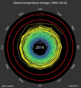
A lot of my friends have posted links to this spiral animation of global temperature anomalies over time. The Climate Lab Book shows how temperatures have changed from 1850 to the present using a spiral graph instead of a linear graph. You can really see how the temperatures have increased over time in this animation. Very cool to look at! Check it out at https://www.climate-lab-book.ac.uk/2016/spiralling-global-temperatures/.
