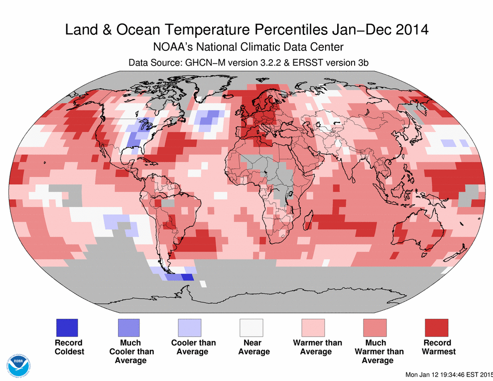
As expected, today both NASA and NOAA released their climate summary reports for 2014 and confirmed that last year was the warmest on record for the globe as a whole (since global records began in 1880). Also as expected, there was a tremendous amount of media attention to this announcement. The temperature map below shows the pattern of temperature variations from the long-term average. The Eastern United States, including most of the Southeast, was one of the few areas across the globe with below-normal temperatures. Many areas, including Alaska and Western Europe, were at near-record warmth. The two agencies used different data sets but reached the same conclusion. The NOAA report from the National Climatic Data Center can be found at https://www.ncdc.noaa.gov/sotc/summary-info/global/2014/12 and the NASA press release is linked here. This AP story describes the difference between the two measurements and what the significance of the record is.
This record was not unexpected. I’ve posted previous blog entries about the anticipated new record. It is also described in this article, which describes why climate in one place (such as the Eastern US) does not necessarily represent what is happening around the planet.
Dr. Marshall Shepherd, UGA geography professor and host of WxGeeks on The Weather Channel, has posted an entry in his own blog explaining some of the comments that you may hear from those who are skeptical of the latest measurements. You can read his list of six things to watch for here.
If you are wondering how likely this value was due to pure chance, Seth Borenstein of AP posted some statistical odds in his article here. Reactions from 21 climate scientists were collected by the Washington Post and published here.
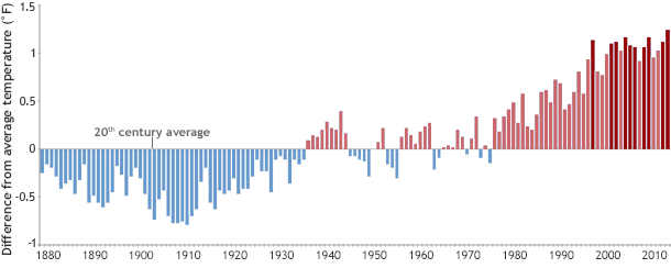
The graph at the bottom right shows that all of the ten warmest years on record (dark red lines) occurred in the last two decades.